A patient-facing digital experience where clarity, accessibility and calm do more for trust than any amount of reassurance copy.
- Client
- Vireo Health
- Industry
- Healthcare
- Year
- 2024
- Services
- Website Design & Digital ExperienceContent & CommunicationSEO & Digital Growth
Overview
What this project is.
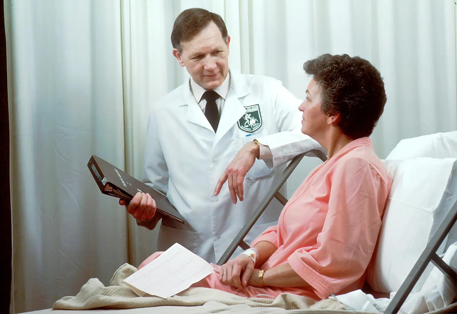
Vireo Health is a concept healthcare provider. The project explores what a healthcare website looks like when it is designed for someone anxious, unfamiliar with medical vocabulary and possibly using it on a phone in a waiting room.
Challenge
The problem to solve.
Healthcare content is dense, regulated and easy to get wrong. It also reaches people at stressful moments. The experience had to be genuinely accessible, structured around what patients are trying to do, and readable without any clinical background.
Insight
What we noticed.
Most healthcare sites are organised around how the provider is structured — departments, specialisms, services. Patients arrive with a symptom, a referral or an appointment, and are made to translate their situation into the provider's org chart before they can find anything.
Strategy
The approach taken.
Rebuild the information architecture around patient tasks rather than internal departments. Lead every section with plain language and place clinical detail one level deeper for those who want it. Treat accessibility as a design constraint from the first wireframe.
Creative Direction
How it looks and moves.
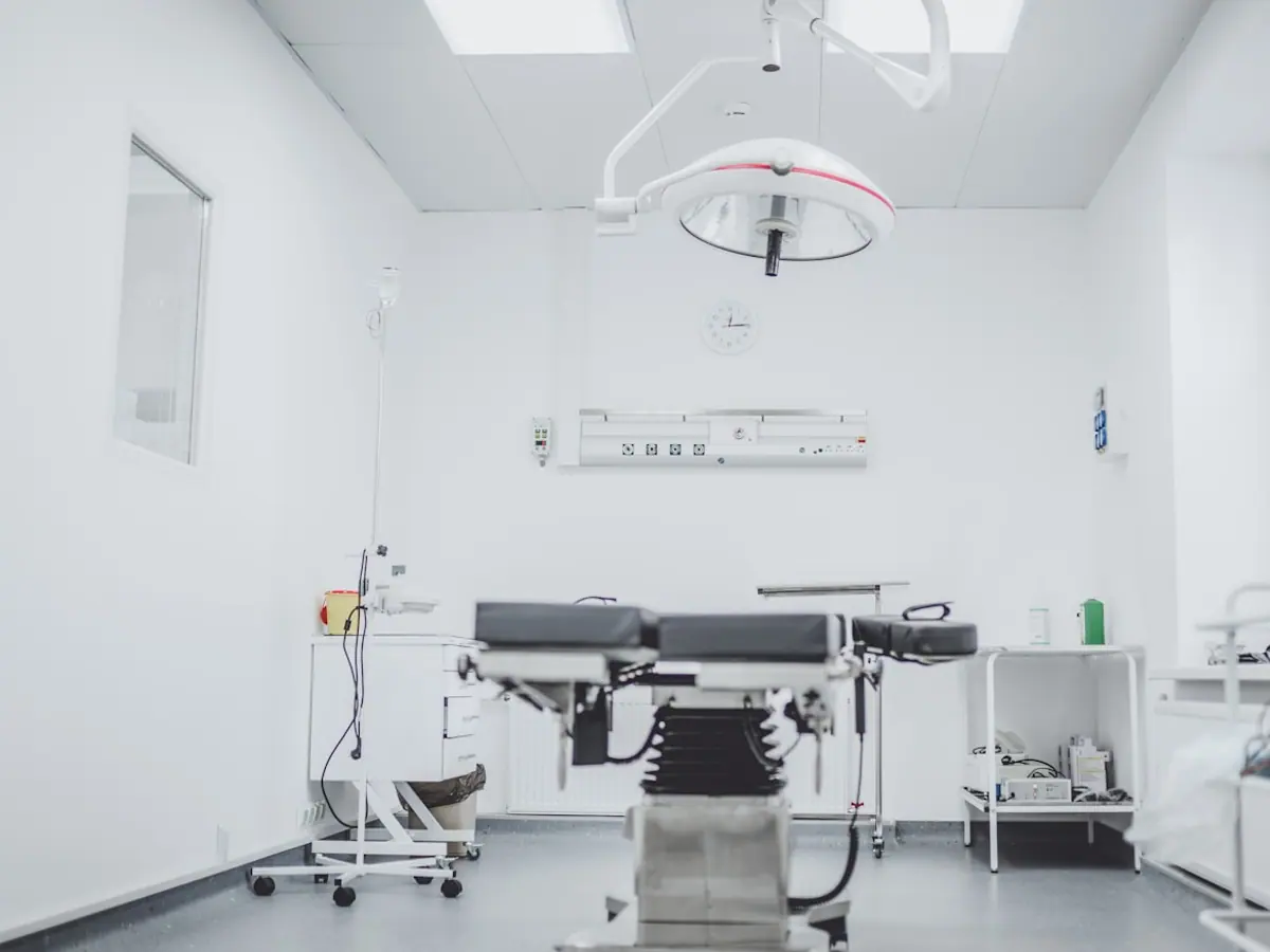
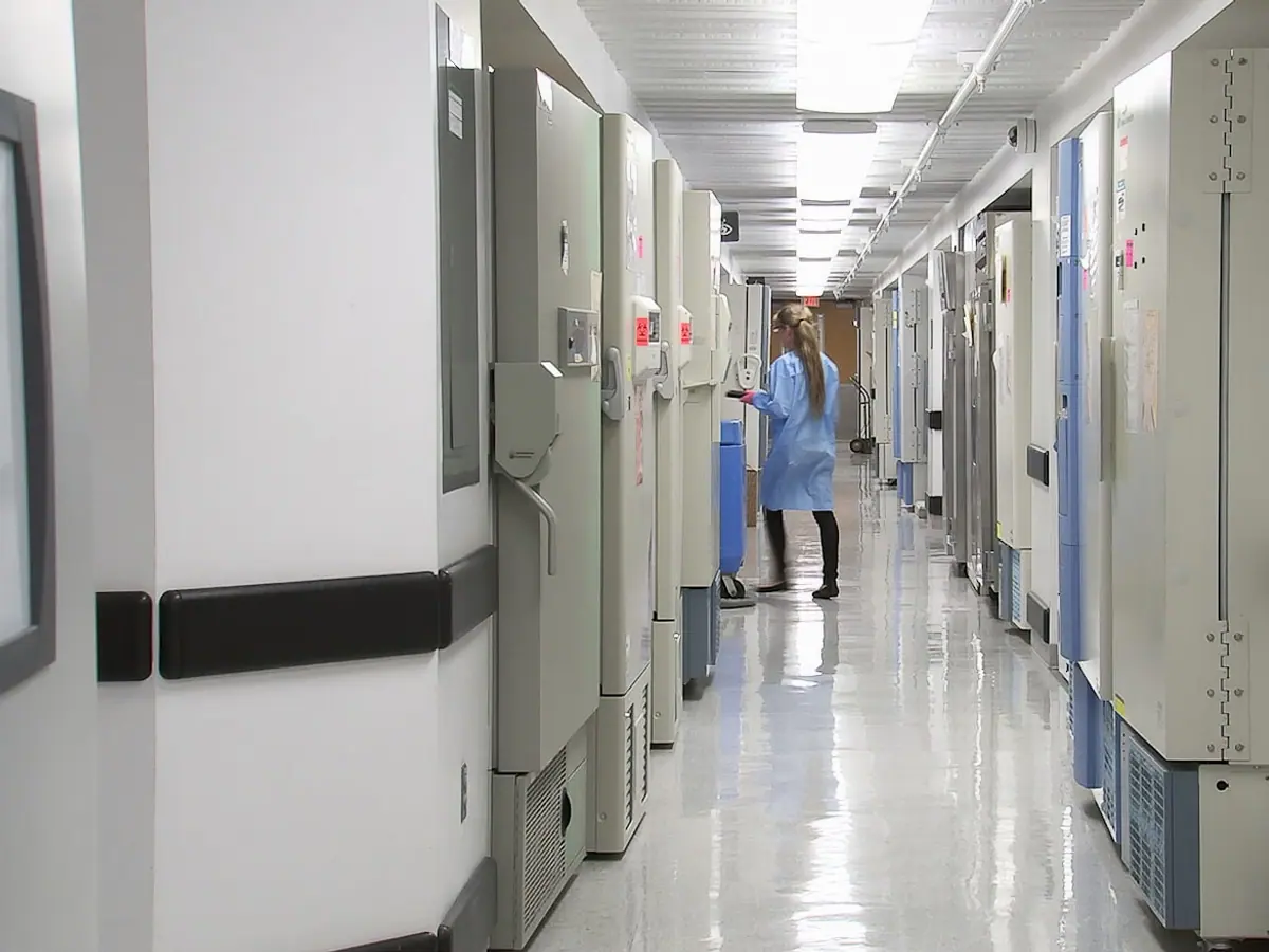
Open, bright and unhurried. Generous type sizes, high contrast, restrained colour and photography that shows real environments rather than staged reassurance. Nothing moves unless movement helps comprehension.

Execution
What the work involved.
Task-based information architecture
Accessibility-led interface design to WCAG AA
Plain-language content rewrite across core pages
Responsive component and design system
Search-led structure for condition and service pages
Appointment and enquiry flow design
Deliverables
- Information architecture
- Design system
- Responsive website design
- Plain-language content
- Accessibility documentation
- Enquiry flow
What it sets out to achieve
The outcome the work is built for.
This is a concept project, so the outcomes below describe design intent rather than measured performance. We publish numbers only where a client has verified and approved them.
Organised around patients
Navigation follows what people arrive trying to do rather than how the provider is structured internally.
Accessible by construction
Contrast, semantics, keyboard navigation and reduced-motion support designed in from the first wireframe.
Readable without a clinical background
Plain language leads every section, with clinical depth available one level down.