How a brand moves, defined as carefully as how it looks — one motion system spanning product, interface and campaign.
- Client
- Orbit
- Industry
- Technology
- Year
- 2025
- Services
- VFX, 3D & Motion GraphicsDigital Branding & Brand IdentityWebsite Design & Digital Experience
Overview
What this project is.
Orbit is a concept technology brand. The project treats motion as an identity component with the same rigour usually given to colour and typography, producing a documented system rather than a set of individual animations.
Challenge
The problem to solve.
The brand's animation was being made per project. Every campaign moved differently, which meant motion contributed nothing to recognition and every new piece started from zero.
Insight
What we noticed.
Movement is recognisable before form is. A consistent easing curve and a signature transition are identifiable in peripheral vision — often faster than a logo placed in the corner of a frame.
Strategy
The approach taken.
Define a small, strict motion vocabulary: one easing family, a fixed set of durations, three signature transitions derived from the brand's curved geometry, and clear rules for when each applies. Small enough to remember, specific enough to be distinctive.
Creative Direction
How it looks and moves.
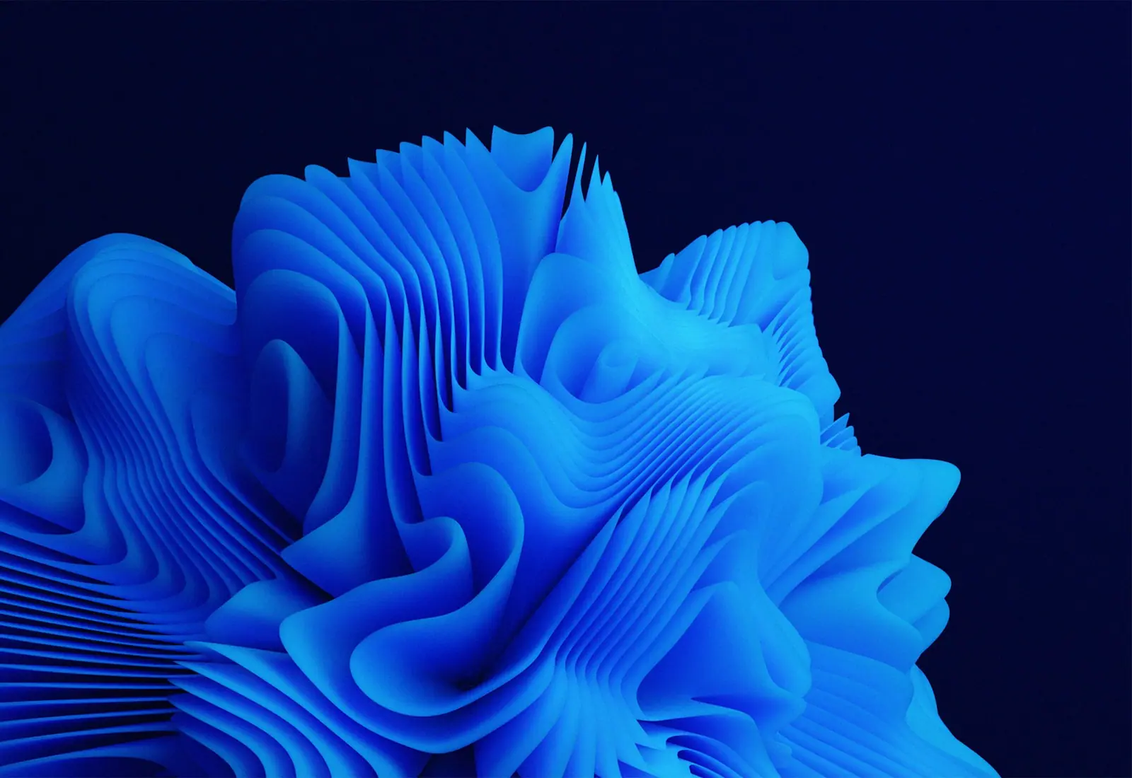
Deep blue gradient fields, layered translucent forms and sweeping arcs that echo the brand's curve. Motion is fluid and weighted rather than snappy — everything decelerates as though it has mass.



Execution
What the work involved.
Motion principles and easing system
Signature transition set
3D look development and material studies
Logo animation and endframe system
Interface motion specification for the web team
Animated social template kit
Deliverables
- Motion guidelines
- Easing and timing system
- Signature transitions
- Logo animation suite
- Interface motion spec
- Social motion templates
What it sets out to achieve
The outcome the work is built for.
This is a concept project, so the outcomes below describe design intent rather than measured performance. We publish numbers only where a client has verified and approved them.
Recognisable in motion
A consistent easing and transition language makes the brand identifiable before the mark appears.
Shared across disciplines
The same specification governs campaign animation and interface micro-interaction.
Faster to produce
A defined vocabulary removes the blank-page problem at the start of every new piece.