
A modern retail brand system designed to hold its shape across store, packaging and social — without needing a different set of rules for each.
- Client
- Meridian
- Industry
- Retail & Consumer
- Year
- 2025
- Services
- Digital Branding & Brand IdentityCreative Design ServicesSEO & Digital Growth
Overview
What this project is.
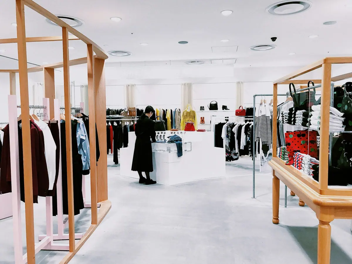
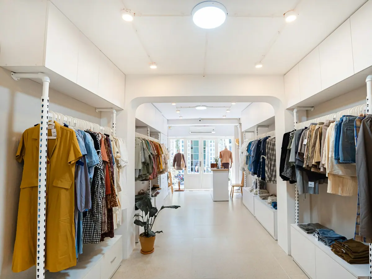
Meridian is a concept homeware retailer with a strong physical presence and a digital identity that had never quite caught up. The project explores what happens when a retail brand is designed for the feed and the shop floor at the same time, rather than translating one into the other after the fact.
Challenge
The problem to solve.
Retail brands live in more places than almost any other category — signage, packaging, price communication, e-commerce, email, paid social and organic content. The identity had to survive all of them. It also had to work at two extremes of attention: a shopper glancing at a shelf, and a scroller giving a post half a second.
Insight
What we noticed.
The brand was being recognised by its product photography rather than by anything it owned. Change the photographer and the recognition disappeared. What it needed was a set of assets that stayed constant regardless of what was being sold that season.
Strategy
The approach taken.
Build recognition on structure rather than styling. A fixed grid, a decisive type pairing and a tightly held colour range became the constants; product, season and campaign became the variables. That gave the marketing team a system that could absorb constant change without ever looking like a different company.
Creative Direction
How it looks and moves.
Confident editorial typography, generous white space and a photographic approach that treats homeware as still life rather than catalogue. Colour is used sparingly and decisively — large fields of it, never small accents, so it registers at distance and at thumbnail size alike.

Execution
What the work involved.
Brand strategy and positioning territory
Logotype refinement and a full typographic system
Colour architecture spanning retail, packaging and digital
Art direction guidelines for product and lifestyle photography
Social and campaign template kit for the in-house team
Search-led content structure for the e-commerce category pages
Deliverables
- Brand guidelines
- Logo and type system
- Colour architecture
- Photography art direction
- Campaign template kit
- E-commerce content structure
What it sets out to achieve
The outcome the work is built for.
This is a concept project, so the outcomes below describe design intent rather than measured performance. We publish numbers only where a client has verified and approved them.
One system, every surface
A single set of rules that covers store signage, packaging, e-commerce and social without requiring separate interpretations.
Recognition without the logo
Grid, type and colour are distinctive enough that the brand is identifiable in a feed even when the mark is out of frame.
Faster seasonal production
Campaign templates let an in-house team turn a new season around without redesigning the brand each time.